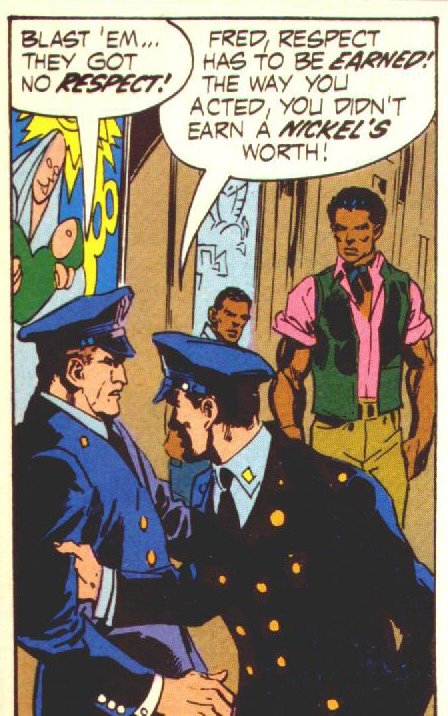
I've been looking at this one for a while now. Initially, I noticed one thing. That Fred's partner, the Good Cop, is pulling Fred back to the spot underneath the halo.
There's also something suggestive about Fred's posture. The profile and the way his neck and head are situated as he says "They got no respect!" reminds me of the sort of villain that Green Arrow is constantly complaining about. The man who doesn't care about anyone but himself and who will step on the backs of the poor and the oppressed to climb into the next higher tax bracket. This guy shows up in nearly every storyline in the ONeil/Adams run. He's usually highly placed in some organization, with lots of underlings he can abuse. Usually, he's brought down because he arrogantly thinks he can manipulate, intimidate or overpower one of the heroes. He comes back within a storyline or two. Different name, slightly changed appearance, but his attitude and posture remain the same. This cop isn't him, but this cop is obviously training to be him unless his partner can keep him reigned in.
(I suspect, however, that he grew a moustache, let his hair go gray and showed up in Nextwave #3 this week, so his partner obviously couldn't handle him)
His partner's face is still shadowed, like it was in the first panel. Fred gets a name, but he doesn't. There are some good reasons to keep him anonymous, actually. Even if John did manage to beat the living daylights, unarmed, out of the armed cop (given that John is the Hero in the story, I wouldn't count this option out) he was still in for a boatload of trouble for it. That was the way of the day. The Good Cop helps him out of it (even though he was unwilling to intervene at the first injustice, when the threat of actual physical violence is present he has enough decency to step in). Keeping him anonymous lets John and the reader know not to expect a "return favor" claim on this act. I heard an adage once that the only true form of charity was done in secret, because that way there was no possible gain. This guy won't even claim a look or word of gratitude.
Two faceless, nameless policemen are symbolic of the police in any given Fictionopolis. In Gotham or Bludhaven, when you come across an unnamed cop (usually with a generic face), they tend to be a bad guy. The majority of cops in those two cities are corrupt. In Keystone, Metropolis, or Opal, an unnamed cop is there to help. By naming Fred and showing his face, he's singled out an individual. He no longer represents the police force in general. This lets you know that in John's hometown, despite the visible poverty, corruption on the police force is not overwhelming. By leaving the Good Cop anonymous, to the point where his face is even shadowed, he can represent every cop in the city. His actions here indicate that the majority of the cops are not guiltless -- they stand by in the face of many injustices -- but they still have it in them to stop a violent threat to the citizenry.
By obscuring the face and omitting the name of the cop, it also encourages reader identification with him. This is common in French Arthurian Romances, there are a number of female characters introduced to help the knight, btu they are never named. They did this because the majority of courtiers who read those romances were female, and a nameless hero's helper allowed them to project themselves into the story.
The last reason (and most likely) I can see to keep the Good Cop's face shrouded is to keep the overall focus on John. At this point in time, it was actually more likely that the Good Cop would end up being the hero than John. Not even showing us the guy's face keeps him in obscurity. There's no threat he'll be a major character or even return. He's a background character, through and through.
He takes the foreground here, though. He's leaning forward, expressing concern and interest. Like the madonna overlooking them in the mural, he's looking after his partner here. He's gently shepherding him out of a situation that will be bad for all involved.
Adams uses the normal artist technique of less detailed, less focused background so that the attention in the individual panel remains on the action. It saves him work, and it keeps the reader from getting lost in the details. As he does this, he manages to continue his characterization of John.
John stands steady, completely ready to defend himself. The lines on his face and arms take on a stony quality. You can tell this man is determined, firmly devoted to his ideals, and willing to stand up for himself. He's a very earthy, very steadfast, very solid person. John's special strength is just that, strength. Steady as a rock.
He's even positioned so that he's overlooking Fred. He's in the right, and winning.
Something about then character positioning and posture in this panel gives the impression of a moving foreground and still background. Part of it is John in relation to the cops. He's towering over them, more so than in the previous panels. It makes me think sidewalk is a downward slope in relation to where I'm standing, and that the cops are traveling down it. The lack of focus that gives John and the domino player such statue-like features helps by conveys stillness, compared to the policemen who are moving.
And how they are moving! To the left of the reader in a story that reads left to right. Fred backs reluctantly out of the panel. His partner is aggressively driving him back to the earlier pages. You can tell they won't be back, because they're not moving forward with the reader. This panel is in the bottom left of the page, there's nowhere else to follow them.
Yes, I do realize how silly that sounds, but it's an effective device. The reader gets the impression that following the cops would mean going back to the beginning of the story. John is the right-most character, the closest to the next sequential panel. He's the one to follow.
Conscious design like this is a beautiful thing, isn't it? So satisfying.
ReplyDeleteBack in my book-larnin' days, I had a teacher explain that a key difference between a good film and a bad film was that in a good film, everything you see is on the screen for a reason.
Why is there a lamp in the foreground of this shot? Why are the characters arrayed around the set like that? What's with the fishtank? If the movie's decent, you can answer questions like that. In the bad ones, the answer boils down to "um...'cause it looked cool."
The same is very true in comics.
Adams, he was a Pagan God of Comics.
I'm diggin' your posts breaking down the panels. Great stuff.
You know, for years now I have blamed O'neill and Adams for ushering in the trend of joylessness that dominates today's superhero comics. I have to say, you are rehabilitating them in my mind.
ReplyDeleteWell thought-out analysis. Although my simplistic mind just gives John props for holding a convincing badass pose while wearing a pink shirt and green scarf.
ReplyDeleteYou know that guy's fearless!
Though Adams drew my childhood Batman, I (like Dan) have come to see his art as clumsy realism. You've definitely opened my eyes to the goodness of his composition with these amazing series of posts. I can't believe you're writing more about a panel than most people write about whole series! Keep it up.
ReplyDeleteA few superhero associations with your reading of the cop: 1) David Fiore (sadly dormant) has written a lot about how it is the anonymity that keeps superheroes from being power fantasies, and ties it in with the Puritan idea that no one but God can know who the true saints really are. 2) Spider-man's full-face mask was also cited by Stan Lee as allowing projection by the reader.